👋Hi, I'm Matthew!
I'm a UX Researcher and Anthropologist based in Pittsburgh. I'm currently a UX Researcher at Thomson Reuters, supporting the digital commerce and product discovery experiences for legal, tax, and risk and fraud customers.
Feel free to check out some of my recent work below, or head over to my projects page to view additional projects.

I'm a mixed-methods researcher with expertise in qualitative and quantitative testing. I strive to use an array of methods to my approach research in order to provide a complete and holistic view of user experience and understanding for product and design partners. I've worked in a variety of spaces, including legal and tax SaaS, Cloud technology, and pharmaceutical and patient platforms. My educational background is in Bio-Medical Anthropology where I focused on the experience of trans individuals navigating and engaging with the healthcare system, and the effects of cross-sex hormone therapy on skeletal development and maintenance.I have experience with a range of research tools, such as UserZoom/UserTesting, Qualtrics, R, Figma, and Adobe/Google Analytics.I am also currently pursuing a Master of Data Science, to continue my learning and development with more advanced quantitative methods and data modeling, and tooling such as Python and SQL.Outside of work, I also enjoy spending time on:
🎓 Mentoring junior researchers on methods and skills, job strategy, resume and project building, and interview preparation.
📷 I've developed an interest in photography. I enjoy finding cool things and places to photograph. At the moment I'm learning how to take full advantage of mobile photography.
✈️ Traveling to new cities, countries, or new neighborhoods.
🐶 Exploring new parks and trails with my cowboy corgi (Pembroke Welsh corgi & Australian cattle dog mix), Lily.
🎮 I enjoy board and video games, and chess.


Overview
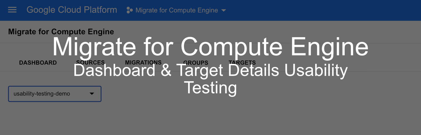
The Migrate for Compute Engine team redesigned the dashboard and target details form based on recommendations from previous research insights and expert review.The goal of this project was to understand what users' pain points and needs are with the current GUI, and explore their thoughts on the new design mocks and if it meets their expectations.
Role
UX Researcher
User Research, Recruitment, Analysis
What is Migrate for Compute?
Migrate for Compute Engine provides a holistic experience within Google Cloud Products to migrate a single or multiple virtual machines from an on-premises data center to Google Cloud Engine. In Migrate for Compute Engine, customers can monitor and manage migrations by seeing statuses, events, and history of target details configurations
Context
I had the opportunity to take on my first Migrate for Compute project shortly after starting my assignment at Google Cloud and getting an understanding for how the platform works. While all of my work is under NDA, I am able to speak broadly to the tasks, methods, and insights that I engaged with while working on this project. Something that has been great about working on UX researcher at Google Cloud has been the opportunity to not only work with designers, but also engineers and product specialists.
Objectives & Method
Objectives
The overall objective that the team wanted to uncover was a better understanding of what the most difficult parts of using Migrate for Compute are.Additionally, we had objectives for both the dashboard and target details form.
Dashboard:
• There was a need to understand how/if the new design would improve user satisfaction when compared to the current design.
• What cards should be included on the dashboardTarget Details Form:
• Do users understand when they can define target details.
• Is the new form easier to understand and complete.
Method
This project included 2 methods employed in 1:1 sessions. We combined in-depth interviews and usability testing in order to gain deep insight into our users' behaviour and feelings.In-depth interviews were used to better understand paint points of using migrate as a whole, and changes that they would like to see.Usability testing was used to understand how users interact with the dashboard and target details form, and to have users run through how they would use the new design mocks.
Participants
We included two groups of users in this study in order to obtain a broad understanding of use. In total we included 9 users with the following breakdown:
• 5 users external to Google, consisting of cloud architects and engineers
• 4 Googlers, consisting of customer support engineers and product specialists
Research Sessions
During the sessions, I combined usability testing with in-depth interviewing to gain a better sense of how users use Migrate in their roles, as well as how we could improve features and functionality.At the beginning of the session I focused on understanding the users' background with Migrate, and cloud products in general. I started with topics such as how long they've been using Migrate, and why use Migrate. As well, I had users describe the most recent time that they used Migrate to move a workload, discussing what went well during that process, and what didn't work for them.After gaining an understanding of the users' background, the remainder of the session was structured so that it flowed in the same way that tasks would be completed; moving from the dashboard, to groups, and finally to the target details form.When discussing the Dashboard I focused on questions aimed to help me understand whether or not they use the Dashboard to monitor migrations, how familiar they are with the various cards available on the Dashboard, and where the Dashboard doesn't meet their expectation. From this, I began to see a trend of users not actually using the Dashboard for monitoring due to it not offering the same level of visibility and functionality that the "Migrations" page offered. I then had users take a moment to look over the new design and then provide their initial thoughts when compared to the current dashboard. The outcome was that users felt that the new design provided needed changes that would make monitoring and troubleshooting migrations easier and faster for them.Next I walked users through the Groups page, allowing them to describe how they would begin to configure new machines that will run the virtual machines that they migrate. Discussing Groups allowed me to guide users towards the Target Details button that was added to the design mock. Users were asked what they thought would happen if the button was clicked, and when clicked they were presented with the updated Target Details form. From here, I had users take some time to review the various pages of the form, and then walk me through how they would complete the form, as well as if they felt the form was what they expected, or if it was missing anything. Overall, users felt that the updated form design improved on the current design and provided them with better visibility of mandatory and optional items, as well as showing them a progress tracker.
Results
After completing all of the sessions I was able to synthesize the data obtained and compare it with previous research. What I found was that users were still had many of the same concerns, focused around time and efficiency when conducting migrations.All users felt that our updated designs addressed most of the pain points that they had with the current UI, with some making additional suggestions on how to go a step further and provide more updates. In total, 16 recommendations were made based on feedback, 8 of which were considered at the highest priority based on user feedback.After wrapping up the project readout, my recommendations were shared with the design and engineering team with a suggested priority for each recommendation.
Wrapping Up
Currently, the Target Details form and Groups page updates have been launched, which include some additional changes suggested by the users. The dashboard update is in progress and should be launched later in 2022. Overall, the project was very successful from a research and design perspective, and many of our ideas on future features and changes were viewed positively. This will allow the Migrate team to consider the testing of these new features in the future, and continue to update the product with new features that users are excited to see.
Thomson Reuters Legal e-Bookstore Device and Use Case Exploration
Organization: Thomson Reuters
Role: UX Researcher
Tools: UserZoom, Qualtrics
Participant Overview
- Survey: 22
- User Interviews: 2
- Mix of legal professional (attorneys, paralegals, legal admins)Overview
Thomson Reuters’ legal bookstore team is investigating deskktop and mobile device use cases in their e-bookstore to better understand why devices customers decide to use a desktop or mobile device to complete their purchase of professional legal books and e-books. It is known that mobile visits are less likely to convert, but the reasoning for why is unclear. This is an unexplored area for the team, and understanding mobile users will help guide the team to better optimize the site to encourage mobile purchase conversion.
Objectives & Method
Research Goals
1. Determine why customers use desktop vs mobile and the factors that influence this choice.
2. Understand how customers conduct product searches.
3. Understand the difference between desktop and mobile performance when conducting a purchase.
Research Approach
I chose a mixed-methods approach, pairing a quantitative survey with qualitative user interviews and site walkthroughsSurvey
• The survey gave allowed us to measure and statistically compare device preferences, satisfaction ratings, and usage behaviors across the purchase journey. This was important for validating whether qualitative themes were isolated opinions or widespread patterns.User Interviews
• The interviews added the behavioral context and nuance. The interviews explored habit formation, workplace workflows and device restrictions, and mobile site walkthroughs and testing. The site walkthrough allowed me to observe friction and pain points in simulated use case scenarios.
Findings
Desktop is preferred because of habit, ease of use, and work environments
The single biggest driver of desktop preference was context. Most users purchase during work hours, at their desk, on their work computer. For most users this has become habit and a preferred method of wor. Participants acknowledged that younger colleagues or attorneys who commute or travel more frequently might have different behaviors, but for the majority, the desktop purchase flow is deeply ingrained.Users were surveyed on their level of agreement for various statements for both desktop and mobile. Example statements are "Desktop/mobile is easier to compare options", "Desktop/mobile is easier to multitask", "Forms are easier to complete on desktop/mobile". Users were asked the same set of 13 statements for both desktop and mobile.What was found was that for most statements, users viewed desktop as significantly easier to use and complete tasks. The statements that resulted in a non-significant difference between desktop and mobile were the speed to complete a purchase, site navigation ease, and payment autofill capabilities.A section to note, users had rated their satisfaction with site navigation as higher on desktop than on mobile, however their statement ratings suggest that one is not easier than the other. What this suggests is that while ease of navigation may not be functionally different, various other factors on desktop are easier and provide stronger experiences than mobile, which can help to mask the negatives of the navigation of a site.
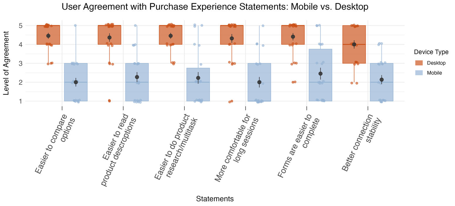
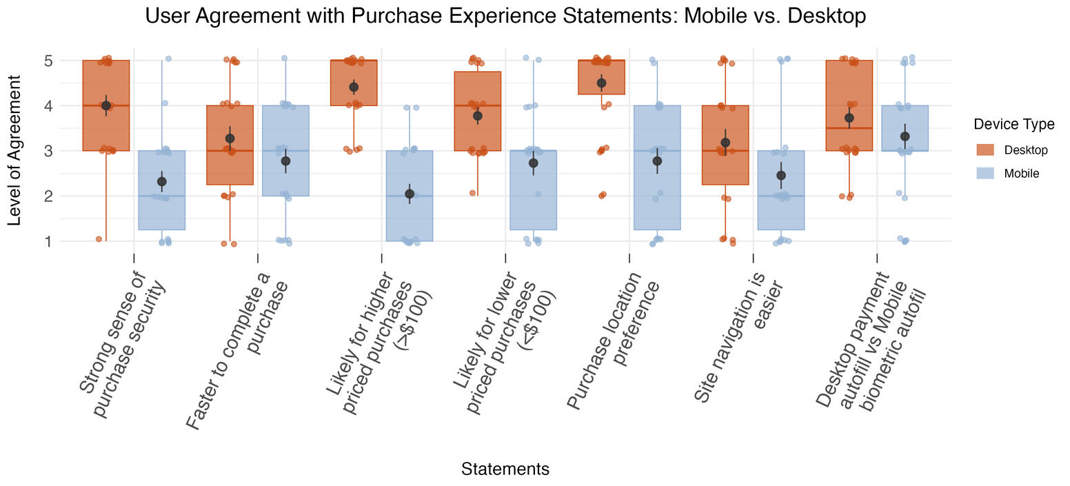
| Statement | Device | Difference in agreement | Significance (p-value) |
|---|---|---|---|
| Easier to compare options | Desktop > Mobile | 2.23x | <0.001 |
| Easier to read product descriptions | Desktop > Mobile | 1.92x | 0.026 |
| Easier to do product research/multitask | Desktop > Mobile | 2x | <0.001 |
| More comfortable for long sessions | Desktop > Mobile | 2.13x | <0.001 |
| Forms are easier to complete | Desktop > Mobile | 1.8x | <0.001 |
| Better connection stability | Desktop > Mobile | 1.87x | <0.001 |
| Strong sense of purchase security | Desktop > Mobile | 1.73x | <0.001 |
| Faster to complete a purchase | Desktop > Mobile | 1.18x | 0.2 |
| Likely for higher priced purchases (>$100) | Desktop > Mobile | 2.16x | <0.001 |
| Likely for lower priced purchases (<$100) | Desktop > Mobile | 1.38x | 0.018 |
| Purchase location preference | Desktop > Mobile | 1.62x | <0.001 |
| Site navigation is easier | Desktop > Mobile | 1.3x | 0.17 |
| Desktop payment autofill vs Mobile biometric autofil | Desktop > Mobile | 1.12x | 0.37 |
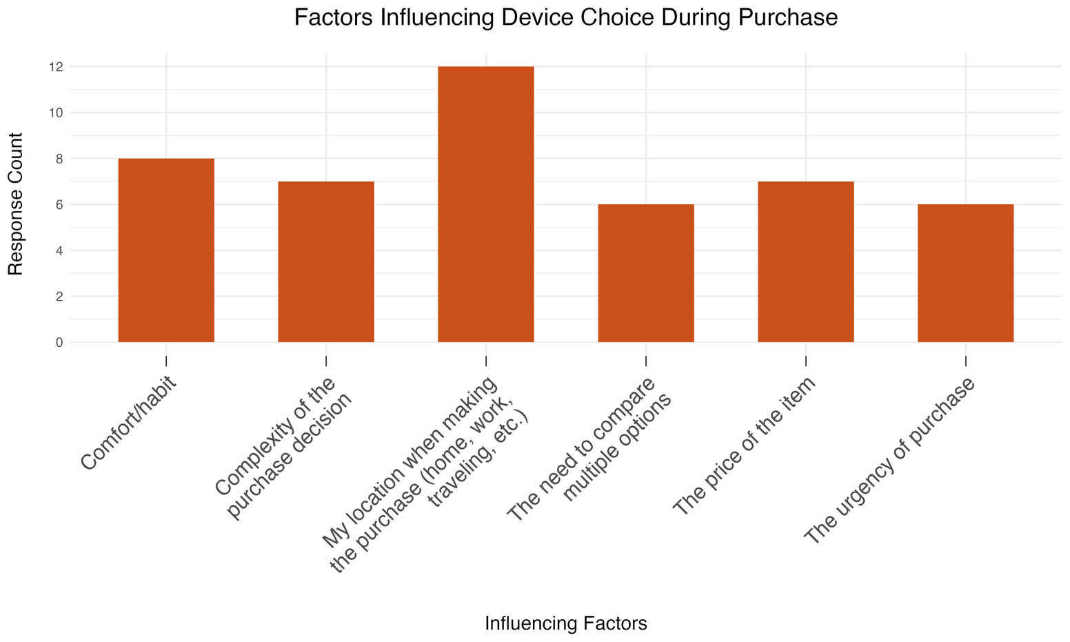
One single factor doesn't determine device use, rather it is a combination of factors
Survey results showed the rates that users perceive different factors influencing their device use, such as location, complexity of the purchase, and cost. However, statistically, none of the results are more significant than the others. What was learned in the interviews was that combinations of factors will determine device use, such as:
• An urgent purchase while being away from the office → mobile purchase
• A complex purchase that requires product comparison → desktopOne factor that most users viewed as important was location. Due to most purchases occurring during the work day, most users will be at the office when they conduct the purchase, resulting in primarily desktop use.
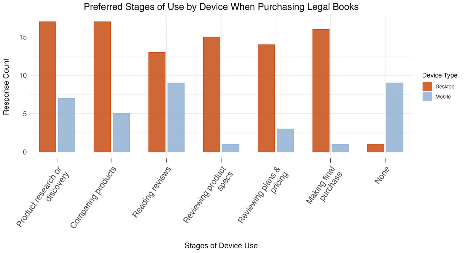
Mobile is used as a research tool, not a buying tool
Both studies converged on this same point. Users will browse, compare, and research on mobile, but when it's time to complete their purchase, they switch to desktop.The survey confirmed this statistically: desktop use was significantly higher across all later purchase stages, while the only stage with no meaningful device difference was reading reviews.This tells us mobile already has a place in the journey, it's just at the top of the funnel rather than end-to-end in the same way that desktop is used from start to finish.
Scrolling is the biggest mobile friction point
During site walkthroughs, participants flagged excessive scrolling across multiple pages: the home page, jurisdiction page, and product detail page. Specific issues included:
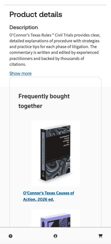
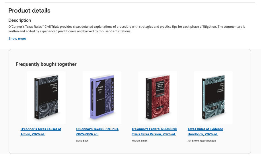
• The jurisdiction list rendered in a single column, requiring long scrolling to find a location• Large product images on the best sellers list pushed content below the fold• On the product page, a "Frequently Bought Together" section appeared before the Additional Information/FAQ section, pushing it further down the page, making it difficult to locate. The desktop version is structured horizontally (right image), while the mobile version is vertical (left image), greatly increasing scroll length.
Users will start on mobile and switch to desktop, but won't switch away from desktop
50% of participants had started a purchase on mobile and completed it on desktop, while only 18% had done the reverse. This reinforces the research-to-purchase handoff pattern and suggests that cross-device continuity should be designed for the mobile-first, desktop-complete journey, not the other way around.
A mobile app is a low priority for low purchase frequency items
Participants were split 50/50 on mobile website vs. app preference. App advocates cited better UI, reliability, and easier account access. But app skeptics raised valid concerns: app fatigue, reluctance to download work apps on personal devices, and the fact that most purchases are infrequent enough that an app offers little utility.Given the even split, the caveats around app use, and the effort required to build, promote, and maintain an app, the data doesn't support deprioritizing the mobile site in favor of an app.
Outcomes
Key post-research outcomes
The data science team ran an A/B experiment based on the UX Research study, where the product page was simplified on mobile, reducing scroll length and information complexity. This test resulted in a 19% increase in mobile e-store conversion rates. The increase is attributed to easier access of product information and key details prior to purchasing. The UX Design team moved forward with the simplified product page design. Further mobile optimizations are being prioritized with engineering input.For future work, I will be collaborating with the data science and web analytics teams to pull user data and web metrics to develop an end-to-end mobile site journey based on tracked page navigation, drop-offs, and conversion routes.
Next steps and key recommendations
The bookstore team will collaborate with design to explore mobile optimization options and further testing will be conducted on future iterations of the mobile store flow.Key recommendations:
• Optimize mobile for early-stage discovery; improve cross-device continuity for handoff to desktop
• Simplify mobile UI flows; use analytics to identify drop-off points on both devices
• Restructure jurisdiction page (multi-column), resize product images, reorder product page content to reduce scroll fatigue
Work in progress
Tools
Userzoom, Qualtrics, Figma175 Participants across all phases
Research Goals
1. Create efficient pathways for product discovery through optimized navigation and taxonomy.
2. Identify universal page patterns that work across legal and tax professional audiences
2. Validate page designs that align with user mental models and Customer Experience Outcomes (CXO).
3. Build a scalable page template repository to accelerate future digital commerce development.
4. Ensure diverse audience needs are addressed across legal professionals (solo to large law firms) and tax and accounting professionals.
Research Approach
I led the research strategy across five iterative phases, collaborating closely with designers, product managers, and analytics teams. My approach emphasized:
• Iterative testing: Applying learnings from each phase immediately to improve designs before the next round.
• Test at multiple fidelities: Move from card sorts and wireframes to high-fidelity prototypes to live pages
• Mixed methods: Combining qualitative 1-on-1 interviews with quantitative validation (i.e. card sorts, tree tests, surveys).
• Cross-functional collaboration: Working in real-time with designers to test multiple variations and implement changes between testing days.
Findings and insights
• Navigation clarity was mixed: Users rated difficulty as 3.6/5 (somewhat easy), but noted too many clicks to reach products (3-12 clicks vs. desired 3-4). Due to unclear product use cases and categories.
• CTA loops and disorienting navigation architecture: Conflicting menus and CTAs on caused users to spend additional time and clicks navigating back and forth between repeating pages in order to locate the correct route to product.
• Page value is determined by quality and clarity of information: The Product and Features Page were viewed as valuable due to important product information, while the Subcategory Landing Page was viewed as the least valuable because of confusing information and poor page structure for navigation.
• Confusion between pages: Users struggled to differentiate Category and Subcategory Landing Pages from product pages, often interpreting categories as product features
• False bottoms: Various marketing banners broke the page flow and created stopping points for users before reaching additional information further down the page.
Action taken on research
• Initial page design templates created: Early stage page templates were created for the primary page series (Discipline Landing, Category, Subcategory, Product, Features).
• Navigation menu simplified: Removed interactive filters and organization type categories; focused on clear category/subcategory structure
• Category and Subcategory Pages refined: Pages were simplified to provide clearer information and product navigation to reduce confusion.
• Product Listing Page optimized: Implemented dynamic product previews in menu, category-based filtering, and clear product cards
• Content hierarchy improved: Reduced white space, removed mid-page CTAs that created false bottoms, repositioned critical information higher on pages
• Language refined: Adopted "practice" terminology for plan selection, clarified General Counsel and Government category descriptions
Measured Impact
• 60% reduction in page design time: New product page development now take 3-4 weeks instead of 8-12 weeks
• 75% reduction in design debates: Clear principles and evidence reduced subjective decision-making
• 5 product teams successfully used templates independently within 6 months
• Consistent navigation: 92% increase of users successfully navigating to product information in ≤4 clicks (up from 45% baseline)
• Improved comprehension: 86% of users correctly identified page purpose and next steps (up from 52% baseline)
• Higher engagement: Features pages saw 40% increase in time-on-page and 35% increase in CTA clicks

Overview
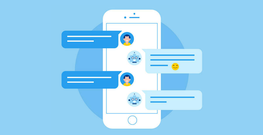
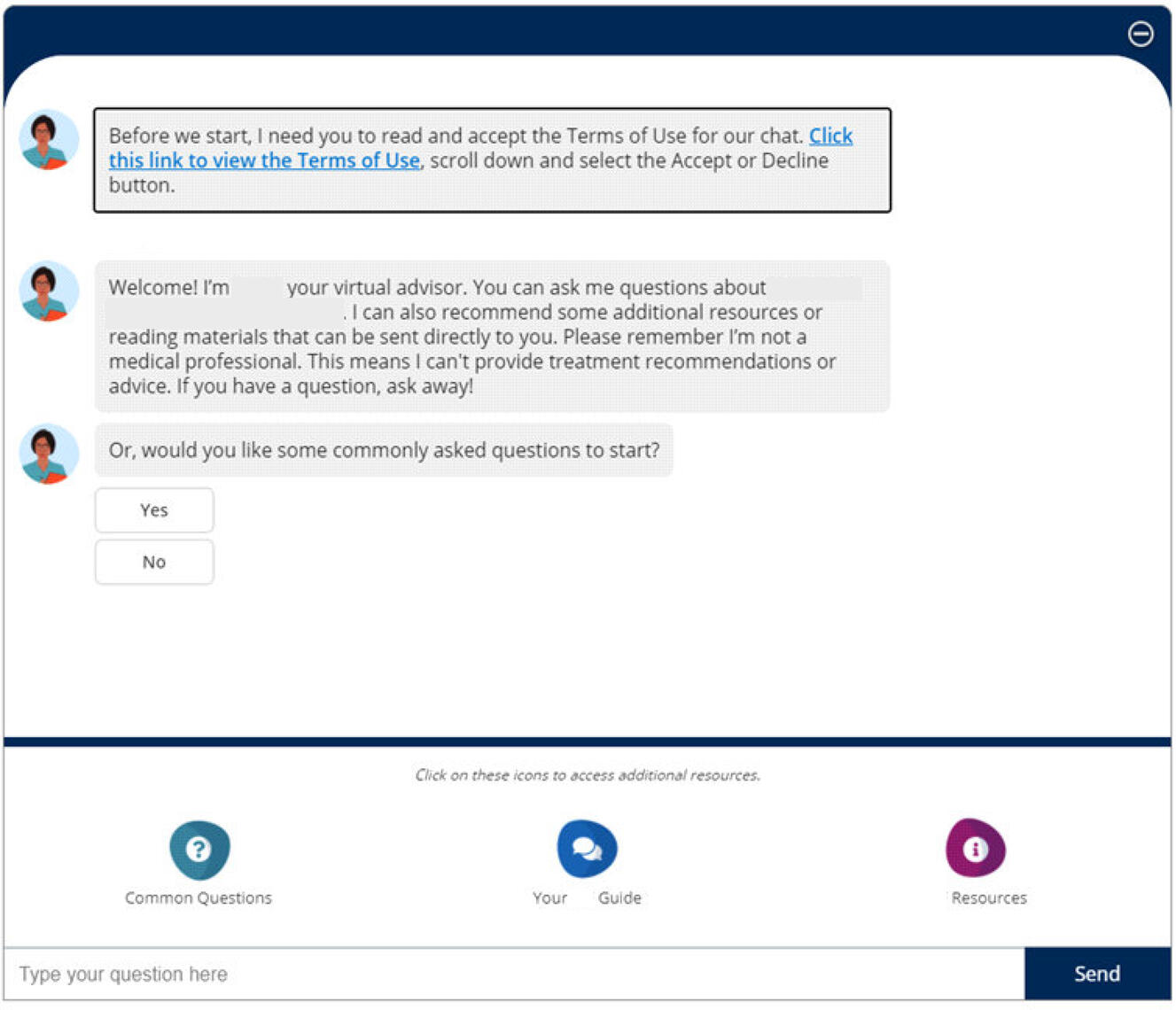
Our pharmaceutical client was looking to develop a chatbot for their patient support website for individuals with lung disease. The goal of this project was to understand the user experience using the Chatbot, including an exploration of the user interface, ease of use, as well as the value of the answers it provided.
Role
Research Analyst
Project management, recruiting, screener and guide development, analysis and insights
Context
I was a member of a three person team, which consisted of two strategists, and myself as a research analyst. The overall project spanned 9 months, and the chatbot usability testing was the second engagement. The 6 remaining engagements consisted of four 3-day diary studies, and one in-depth interview. The project was ethnographic in nature, and as such we aimed to maintain the same participants throughout the entirety of the study. It's important to note that lung disease in a difficult condition to live with, and as such we had drop-outs and had to replace them with new participants when possible.All references to the client and their product name(s), patients/users, and the specific lung disease condition have been removed from text and images in order to comply with NDAs and confidentiality agreements.
Objectives & Method
Objectives
The overall objective for the project and client was to understand the patient experience using the Chatbot, including an exploration of the user interface, ease of use, as well as the value of the answers it provided.Additional objectives that we had to help guide the research were:
• The degree to which the Chatbot is intuitive to use
• Patient satisfaction with the answers provided by the Chatbot
• Patient preferences for specific design features
• Patient impressions and attitudes about the value and utility of the tool
• Patient’s likelihood of using the tool again and their likelihood of recommending it to other patients
Method
45-minute ethnographic-oriented usability testing was the preferred method for this engagement in the project. What this method allowed us to do was combine the techniques of ethnographic immersions with usability testing to gain a better understand of the participants as people living with this condition, as well as deep dive into their experiences with chatbots in general, followed by their testing of our client's prototype.
Participants
• This engagement included 6 participants
• All participants had been diagnosed with lung disease, with an age range of 50-70
• All participants were currently being treated with medication, or had previously been treated with medication
Research Sessions
Introduction
The objective of the introduction was to encourage respondents to feel at ease and comfortable expressing their opinions throughout the session. It also allowed us to better understand them as a person and patient with lung disease, rather than just a potential chatbot user. The sessions began with a brief introduction of the participant; who they are, how long they've had lung disease, their past and current treatments, and how they're managing their condition. In this section of the session, we wanted to build foundational knowledge of each participant to help us understand the context of their responses when testing the chatbot.
Participant approach to seeking information
After the brief introduction, we wanted to try and understand how the participants seek out and obtain information related to their condition. The focus was on the types of tools and resources that participants interact with to seek out information other than their doctor or physician, and how knowledgeable they feel they are about their condition.Participants were probed on their experiences with obtaining information online. We wanted to understand the various types of online sources, if any, that they used to obtain information, how trustworthy they feel the sources are, and lastly if they've ever interacted with or encountered a chatbot on an informational website.From here, participants were presented with the chatbot prototype, and were asked to take a few minutes to explore on their own. They were tasked with using the chatbot to try and answer or get information on the questions that they had mentioned they've searched for previously.
Once an understanding of how participants seek our and evaluate information, they were presented with the chatbot prototype, and were asked to take a few minutes to explore on their own. They were tasked with using the chatbot to try and answer or get information on the questions that they had mentioned they've searched for previously.
Participants were asked to describe their thought process and what they were doing as they explored the chatbot. Participants were tasked to complete this on their own, however if blockers or issues were encountered, we were able to assist them.Once they completed their exploration of the chatbot participants explained how they felt the experience was. We collected how difficult or easy they thought the chatbot was to use on a scale of 1-10. We explored their thoughts on if they felt they were able to get the answers to the questions or information that they were looking for, how relevant the information was, and if they would use this chatbot if they came across it on a website.
Optimizing the Chatbot
The final section of the session focused on how the chatbot could be optimized to better fit the participants' needs. Discission surrounded the idea of removing the open text field and only offering pre-selected options and buttons, and whether or not this would be useful. As well, participants were asked how useful they felt the “Common Questions” provided were during their experience, and if there were any additional questions that they felt should be added. Finally, participants were asked whether or not they would recommend this chatbot to other patients, and why or why not.
Results
Areas of Focus
After completing all of the sessions and analyzing the data, we presented the client with 3 areas of focus based on the findings.
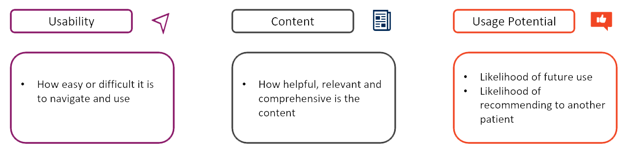
Usability
When looking at the usability of the chatbot, we uncovered a few key observations on how the participants used and felt about the chatbot.Overall participants felt the chatbot was easy to use and navigate, but there is a short period of adjustment. This was not a period of frustration, but for most, an expected period of learning as they engage with new tech, and after this period of adjustment, participants were able to navigate the basics (where to click and type) of the chatbot with ease.Ease of use was attributed to the design of the chatbot, allowing participants to easily understand where to type and how auto-generated questions worked, even if there was no previous experience with chatbots.However, there were some design elements that participants found frustrating and that made the experience difficult.
• The chatbot difficult was to read due to the small font size
• It wasn't possible to expand the chatbot so that it was larger on the screen
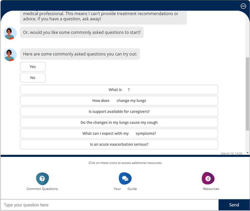
• One of the main challenges when it came to the design was the scrolling feature, which didn't auto-scroll the chatbox when the chatbot responded to a question, leaving participants confused about where the answer wasAdditional usability observations were that participants tended to gravitate towards the "common questions" provided by the chatbot, rather than typing out a question. This was attributed to a couple of reasons:
• There were two ways to select common questions, making it more likely that participants would choose this route
• The “open text” field was farther away from the main chat area, making it more likely that participants would see and select “common questions” first
Content
Most of the feedback about the content of the chatbot came from the level of knowledge that participants already had about their condition. It was discovered that patients with lung disease tend to be more knowledgeable about their condition due to the potential severity of the condition. Due to this, the common questions were viewed as less relevant to these participants. However, many noted that these types of questions would be helpful for individuals who have been newly diagnosedWhen discussing the "open text" field, in only a couple of cases was the chatbot able to provide a relevant and helpful answer, but even so this was not enough to satisfy the participants' needs. While the information was clear, it didn't satisfy their needs, and for the most, the information they were seeking was not found through the content of this chatbot.
Additionally, what was found was that when participants received an irrelevant answer or were asked to rephrase, they questioned/blamed themselves. They thought they did something wrong such as spelled something wrong, asked the wrong question, and placed blame on themselves. Finding ways to reword a question can be challenging for some participants. Ultimately, after a couple of tries, some participants expressed that they would have given up, either closed the chatbot or tried a different question altogether, if they had not been in a research session.
Usage Potential
On the topic of usage potential, While participants appreciated the effort of the chatbot, most noted they likely would not use the chatbot again. This was because the participants in our study were highly knowledgeable about this condition, so any information provided to them must be more comprehensive than what was currently provided in the chatbot.Some participants mentioned that they would recommend this chatbot for someone who is newly diagnosed, but they also noted that there are a large number of resources online that would be more helpful.
Wrapping Up
After concluding the analysis and running through the results with the client, it was decided that the best route to follow would be to discontinue the chatbot for this patient group. The resources that were already provided on the patient support site as well as their partnered sites provided more detailed and easy to access information that the chatbot was unable to communicate. This helped to save the client time and money by not having to rebuild the chatbot when other resources are already available.The project continued with the remaining diary sessions to gain an even deeper understanding of the participants so that the client could continue to build out their support resources for their patients.
As part of a large-scale digital rebrand, Thomson Reuters set out to modernize its digital commerce, product discovery, and account management experiences. While individual product teams had evolved independently over time, the result was a fragmented ecosystem: inconsistent visual design, cluttered layouts, and uneven adherence to the design system.Pages often diverged from templated structures, increasing cognitive load and creating friction for legal and tax professionals who expect clarity, precision, and efficiency. Beyond visual polish, the initiative required content consolidation, the introduction of new features, and the creation of standardized page templates aligned with the design team’s updated UI component library.Project Goal:
Validate the new brand system across critical user journeys, establish research-backed design principles for page templates and components, and enable scalable adoption across product teams.
Objectives & Strategy
The Goal: Optimize navigation and taxonomy to create efficient discovery pathways, validate mental models across diverse personas (solo practitioners to large firms), and build a scalable, research-backed template repository.Research Strategy: Multi-Fidelity Iterative Research
I led a five-phase research approach that transitioned from abstract information architecture to high-fidelity interaction.Mixed-Methods Foundation
Quantitative: Card sorting and tree testing to evaluate taxonomy clarity and navigation success.
Qualitative: One-on-one interviews to uncover the reasoning behind user decisions, confusion, and misinterpretations.I tested at various phases of development:
• Early-stage foundation: Understanding how users engage with the site and discover product.
• Wireframe testing: Testing page structure, menu architecture, and next steps decision making.
• Prototype testing: Finalizing the UI and CTA placement, content structure in journey context, and page flow in small scale journeys.
• End-to-end testing: A complete end-to-end test with a functional prototype of the updated site architecture. Allowed users to view pages in context of a full journey, rather than in page specific testing.Real-Time Collaboration: I worked side-by-side with designers to pivot prototypes between testing days, ensuring we were able to test the most recent iterations with new participants.
Thomson Reuters is modernizing its digital commerce experience with a comprehensive rebrand across commerce, product discovery and account management pages. The existing site had inconsistent visual design from various product teams, cluttered layouts that did not follow the templated design system, and lacked the modern appearance expected by legal and tax professionals. Beyond aesthetics, the team was looking to consolidate content, create new features, and establish updated page templates that adhere to the design teams new UI design library components.
Research Goals
1. Validate new brand designs across all critical commerce, product discovery, and account management pages.
2. Identify optimal visual hierarchies, layouts, and page themes.
3. Test content organization to reduce cognitive load and improve task completion.
4. Create evidence-based design principles for the page template and design component repository.
My Approach
I designed a phased mixed methods research program that validated foundational elements (homepage, discipline pages, feature pages, and plan pages) before testing complex flows (billing, renewals, support). Each phase ran in 2-4 week cycles, with visual findings dashboards created in Lucid to enable real-time designer collaboration without waiting for full reports to be published.
Key Findings & Design Impact
Color & Visual Hierarchy
Finding: Users wanted visual interest but needed pages to remain "clean." Dark colors worked well in small, contained areas (hero banners) but felt overwhelming across entire page sections.
Design Principle Established: "Light backgrounds for large sections, darker colors for focused areas."
Impact: Adopted blue background hero for product pages; maintained light backgrounds for billing tables and subscription pages; used dark green only for hero banners and small CTAs.Transparency & Information Clarity
Finding: Users needed exact pricing information, not percentages. Showing "6% increase per year" didn't help users understand value. Showing exact monthly costs ($100/month Year 1, $106/month Year 2) made savings immediately clear.
Design Principle Established: "Show, don't calculate."
Impact: Implemented exact pricing display for multi-year terms; added term start/end dates; included "new" and "upgrade" indicators on plan offers; showed payment timing clearly in autopay flows.Content Organization & Efficiency
Finding: Users preferred condensed layouts showing all options on a single screen. Visual containers (boxes) improved clarity and accessibility by creating larger click targets.
Design Principle Established: "Condensed doesn't mean cramped."
Impact: Adopted table format for credit selection over column layouts; condensed ticket submission flow to single-screen views; added containers around product groups for easier differentiation.Navigation & Task Completion
Finding: Users consistently missed CTAs placed mid-page. The "Explore more features" link was frequently overlooked, and "Additional Features" CTAs created false bottoms that stopped scrolling.
Design Principle Established: "Clear paths trump exploration."
Impact: Repositioned feature navigation to be more prominent; removed mid-page CTAs that interrupted content flow; connected plan offers directly to comparison tables; implemented horizontal step trackers with clear titles.Support & Help Pages
Finding: Users expected support pages to focus on product questions and customer service. Featured articles and product highlights felt promotional and caused confusion about page purpose.
Design Principle Established: "Page purpose should be immediately clear from content."
Impact: Removed featured highlights and replaced with product support links; made contact information visible on all support pages; prioritized search functionality; focused content on relevant FAQs.
Research Impact
• Updated templates launched to all product teams. Authoring time for new pages cut from 3.25 hours to 1.75 hours.
• Research validated brand tokens and components have resulted in faster design iterations
• Design finding dashboard increased and streamlined design updates and turnaround by up to 50%.
• Consolidated 13 team-specific design systems into a single and consolidated Design Component Library
• 100% of research-backed page templates to launch in 2026.
Thomson Reuters Digital Product Discovery & Page Navigation
Organization: Thomson Reuters
Role: UX Researcher
Tools: UserZoom, Qualtrics, Figma
Participants: 175 Legal and Tax professionals (mix of customer and non-customer)Overview
Thomson Reuters’ digital ecosystem was struggling with website navigation and architecture: users were overwhelmed by options, menus, and pages, and were struggling to find specific products. With a vast catalog spanning legal, tax, and government sectors, the existing site architecture and taxonomy required up to 12 clicks to reach a product page. There were hundreds of filler pages and routes, that prolonged a visitor's journey to reaching product. This was hindering product discovery, and impacting potential customer conversion.
Objectives & Strategy
The Goal: Optimize navigation and taxonomy to create efficient discovery pathways, validate mental models across diverse personas (solo practitioners to large firms), and build a scalable, research-backed template repository.Research Strategy: Multi-Fidelity Iterative Research
I led a five-phase research approach that transitioned from abstract information architecture to high-fidelity interaction.Mixed-Methods Foundation
Quantitative: Card sorting and tree testing to evaluate taxonomy clarity and navigation success.
Qualitative: One-on-one interviews to uncover the reasoning behind user decisions, confusion, and misinterpretations.I tested at various phases of development:
• Early-stage foundation: Understanding how users engage with the site and discover product.
• Wireframe testing: Testing page structure, menu architecture, and next steps decision making.
• Prototype testing: Finalizing the UI and CTA placement, content structure in journey context, and page flow in small scale journeys.
• End-to-end testing: A complete end-to-end test with a functional prototype of the updated site architecture. Allowed users to view pages in context of a full journey, rather than in page specific testing.Real-Time Collaboration: I worked side-by-side with designers to pivot prototypes between testing days, ensuring we were able to test the most recent iterations with new participants.
Key Findings and Results
1. Click Debt & CTA Loops
Users spent a significant amount of time trapped in navigation loops. Conflicting menus options and redundant CTAs forced users to move back and forth between repeated pages just to find a route to the correct product.
The Data: Baseline navigation success (reaching a product in ≤4 clicks) was only 45%.
• Navigation clarity was mixed: Users rated navigation difficulty as 3.6/5 (somewhat easy), but noted too many clicks to reach products (up to 12 clicks vs. desired 3-4). Due to unclear product use cases and categories.2. Category vs. Product Confusion
Users struggled to differentiate between the Category and Subcategory Landing Pages and the actual product offerings. Many users interpreted the category/subcategory pages as product pages, and the various categories on each page as descriptions as product features, leading to incorrect assumptions and confusion about the products being offered.3. Consistent False Bottoms
Marketing banners and CTAs placed mid-page acted as visual "stop signs". Users perceived these banners as the end of the page, missing important product details located further down.4. Page Value and Quality
Users determined the value of a page by the quality, clarity, and usefulness of the information in getting them to their product destination. The 'Product Page' and 'Features Page' were viewed as slightly more valuable due to the important product information provided and a simpler page format. This was in contrast to the Subcategory Landing Page which was viewed as the least valuable because of confusing page information and poor page structure for navigation.

Acting on Findings
| Problem | Research-Driven Solution |
|---|---|
| Complex Taxonomy | Simplified Navigation: Refined the menu navigation to provide all relevant information faster rather than using sub-menus. Added direct product navigation to the menu. Reduced the number of pages required to view before reaching product. |
| High Discovery Friction | Introduced dynamic product previews within navigation menus and category-level filtering to support comparison without page-hopping. |
| Information Gaps | Content Compression: Reduced excessive white space and adjusted mid-page marketing banners to eliminate false bottoms. Made product content more visible to avoid category vs product confusion. |
| Language Barriers | Domain-Specific Terminology: Adopted "Practice" terminology for plan selection to align with how legal and tax professionals actually speak. |
Research Impact
This research-led redevelopment helped to transform Thomson Reuters digital commerce experience from a point of confusion and frustration, into a more streamlined experience for product discovery.Efficiency Metrics
• 60% reduction is design time: Launching a new product page now takes 3–4 weeks, down from 8–12 weeks.
• 75% fewer design debates: Stakeholder discussions moved from subjective opinion to evidence-based decisions grounded in user data, speeding up design to development timelines.User Performance Metrics
• Navigation Success: 92% of users now reach relevant product information within ≤4 clicks.
• Comprehension: 86% of users accurately identify where they are and what to do next.
• Engagement: "Features" pages saw a 40% increase in time-on-page and a 35% lift in CTA clicks.